2016
Quizlet
CLIENT
Quizlet
ROLE
Product Design
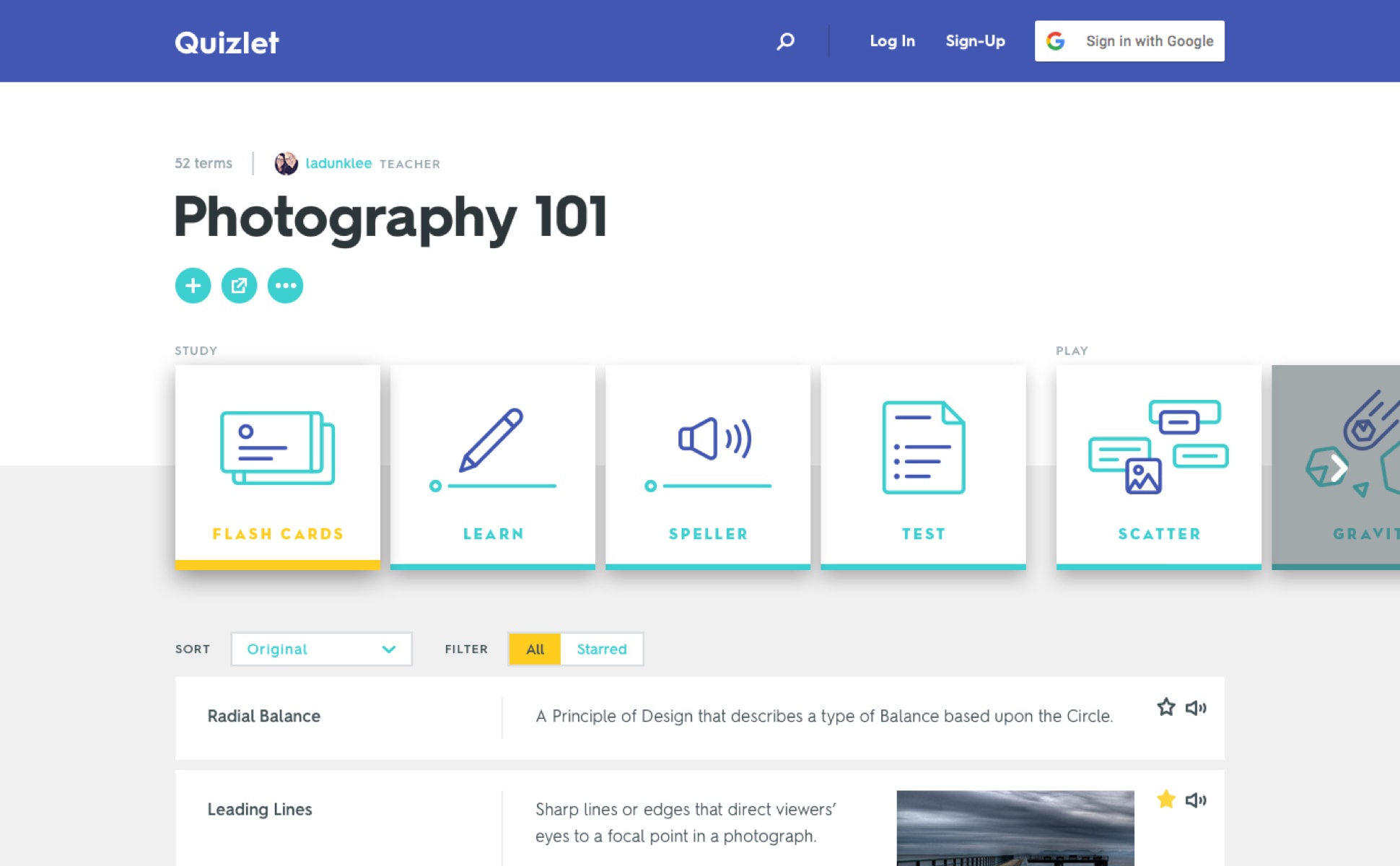
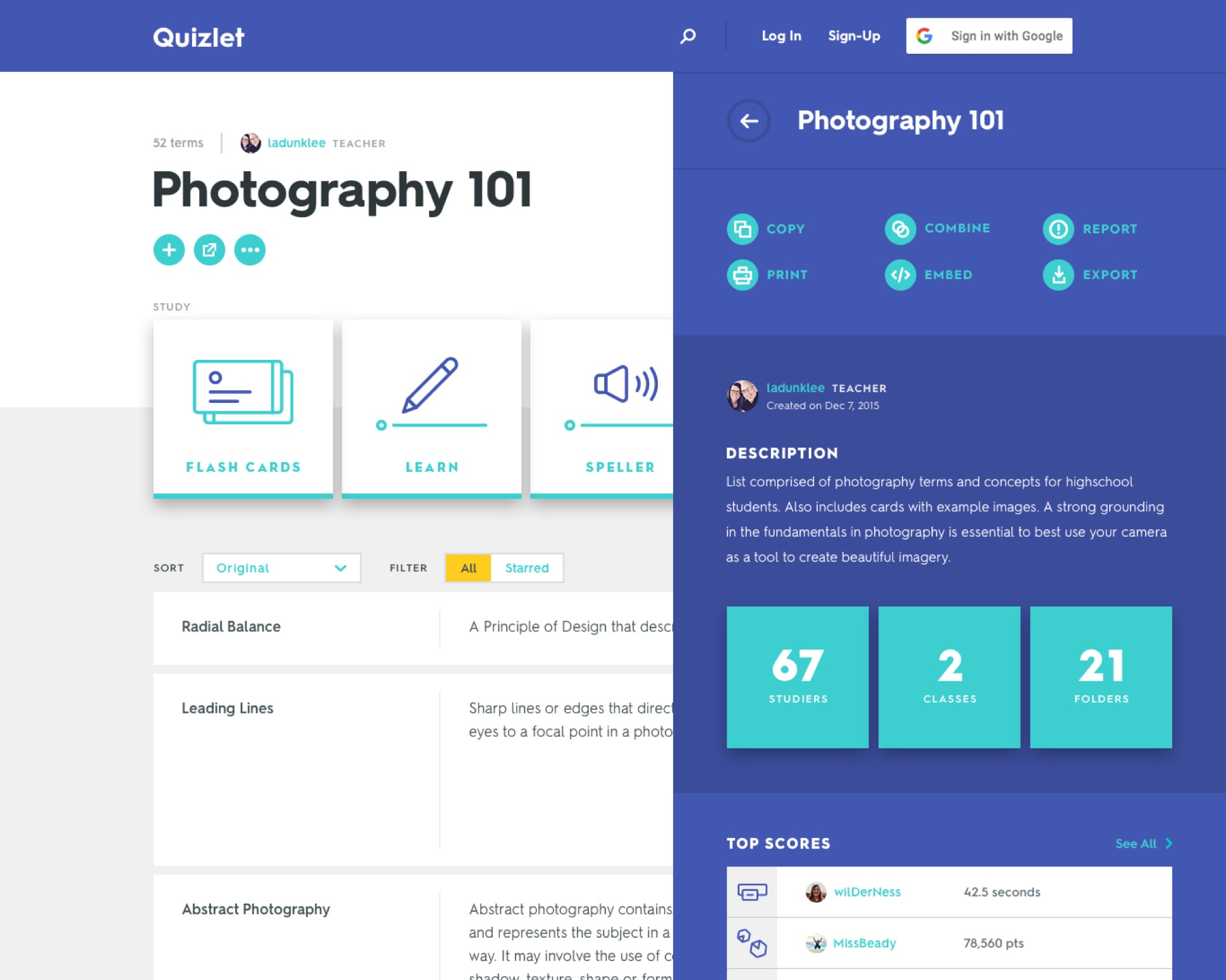
Quizlet asked us to establish a new look and feel for their website, without doing an entire redesign. We created a fresh, expandable system for them to use across their product.
Quizlet.com is a student driven product, but all ages use it for both vocational and professional development. The design needed to appeal to a wide age range and be relatable and easy for everyone to use.


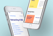
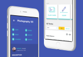
'SET PAGE' DESIGN
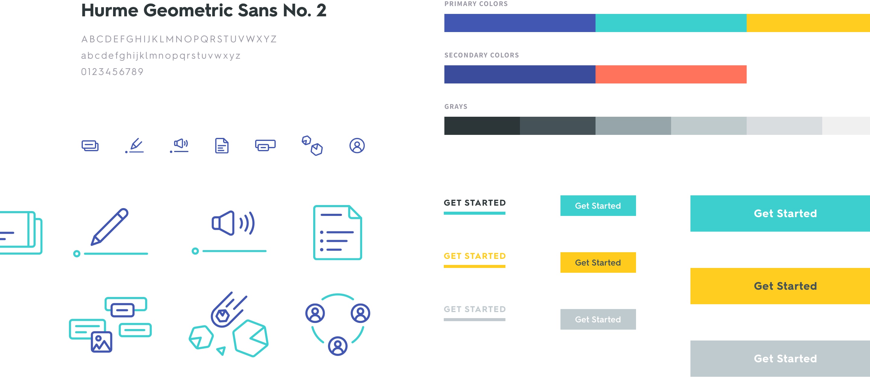
To appeal to a broad demographic we brought in energetic colors and icons to make the design playful and learning feel fun. Keeping the look clean and simple helped to prevent it from looking too young.


COLORS & TYPOGRAPHY
Our detailed style guide for Quizlet's new design system gave their team the ability to continue applying the system throughout their entire site.
