
2017
Hennessy Campaign System
CLIENT
Hennessy
ROLE
Concepting, UX, System Design
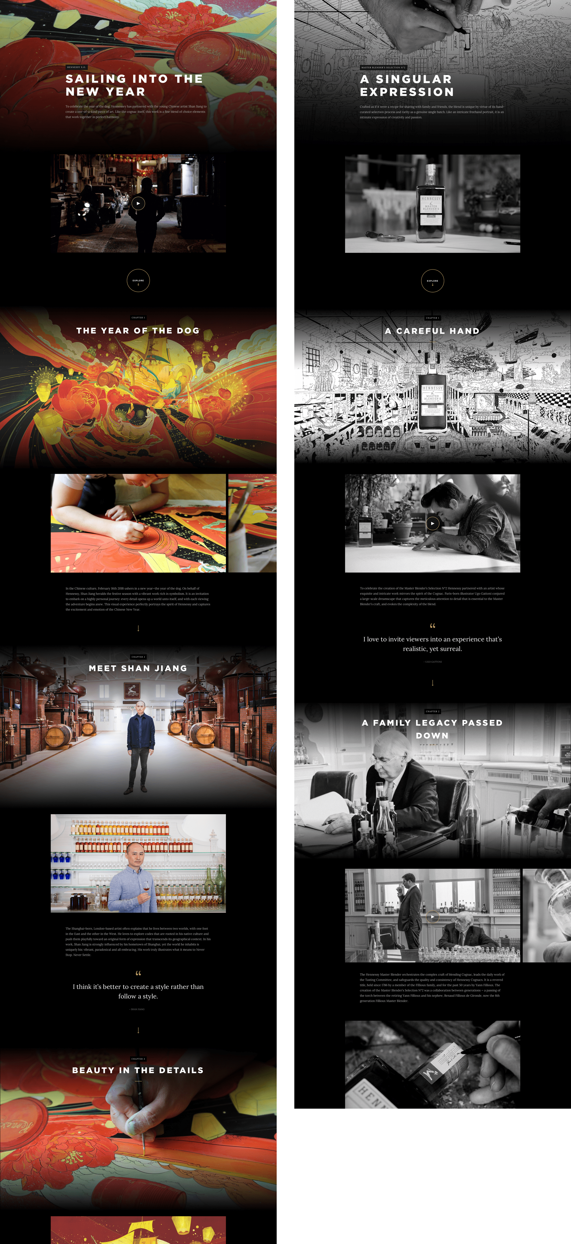
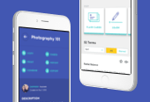
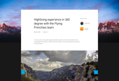
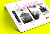
Hennessy has a constant flow of campaigns for their products, but generally little time to design the desired custom site for each one before launch. They needed something flexible enough for any of their products or events that could be integrated into the existing product pages without taking the user away from the purchase flow or getting in the way.

UX GOALS
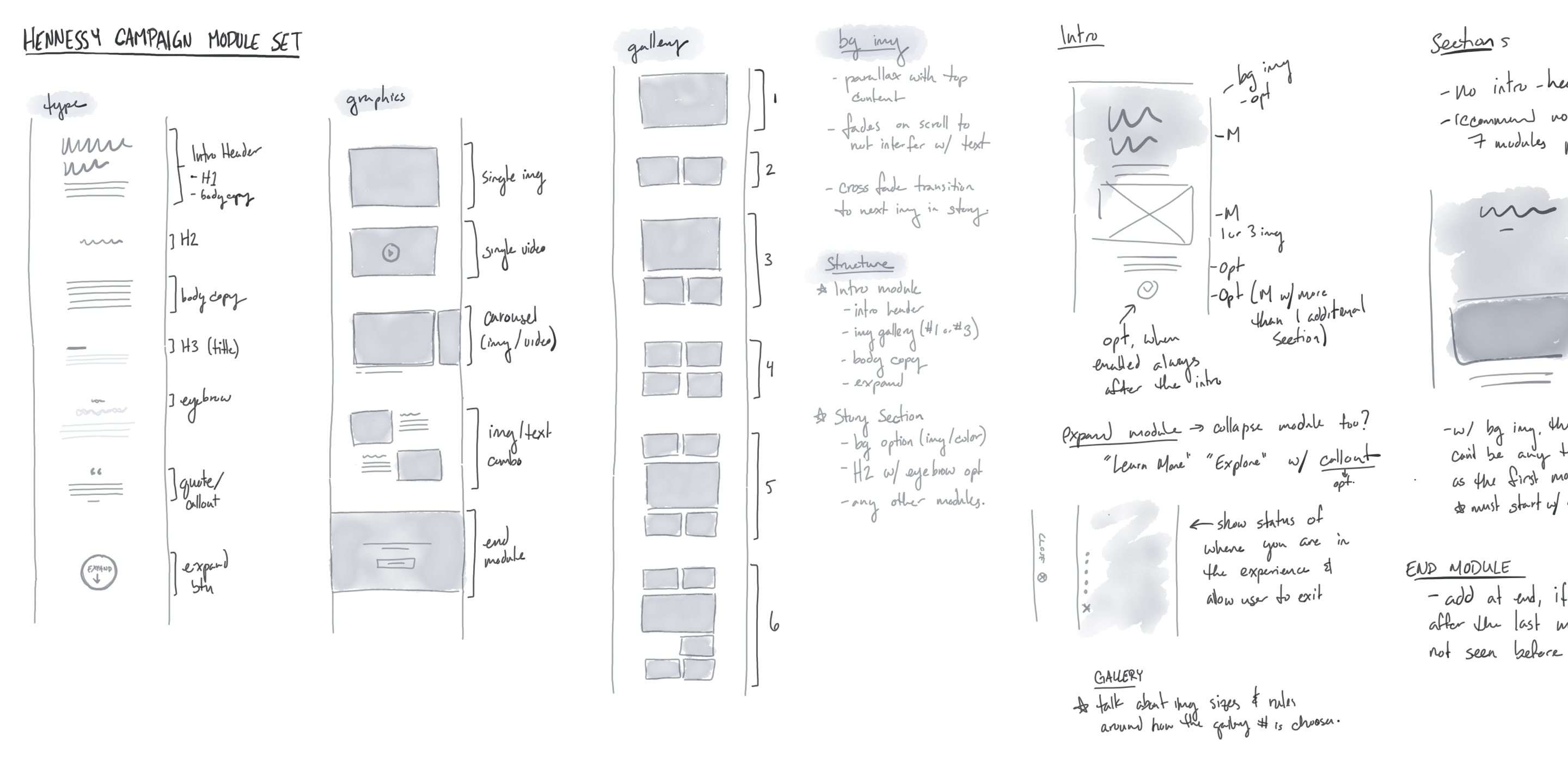
We began by defining what content types would be the most useful and allow Hennessy the greatest flexibility in their system. Our challenge was to create something that felt custom, but that could still be easily used in their CMS.

EXPANDABLE CAMPAIGN SYSTEM
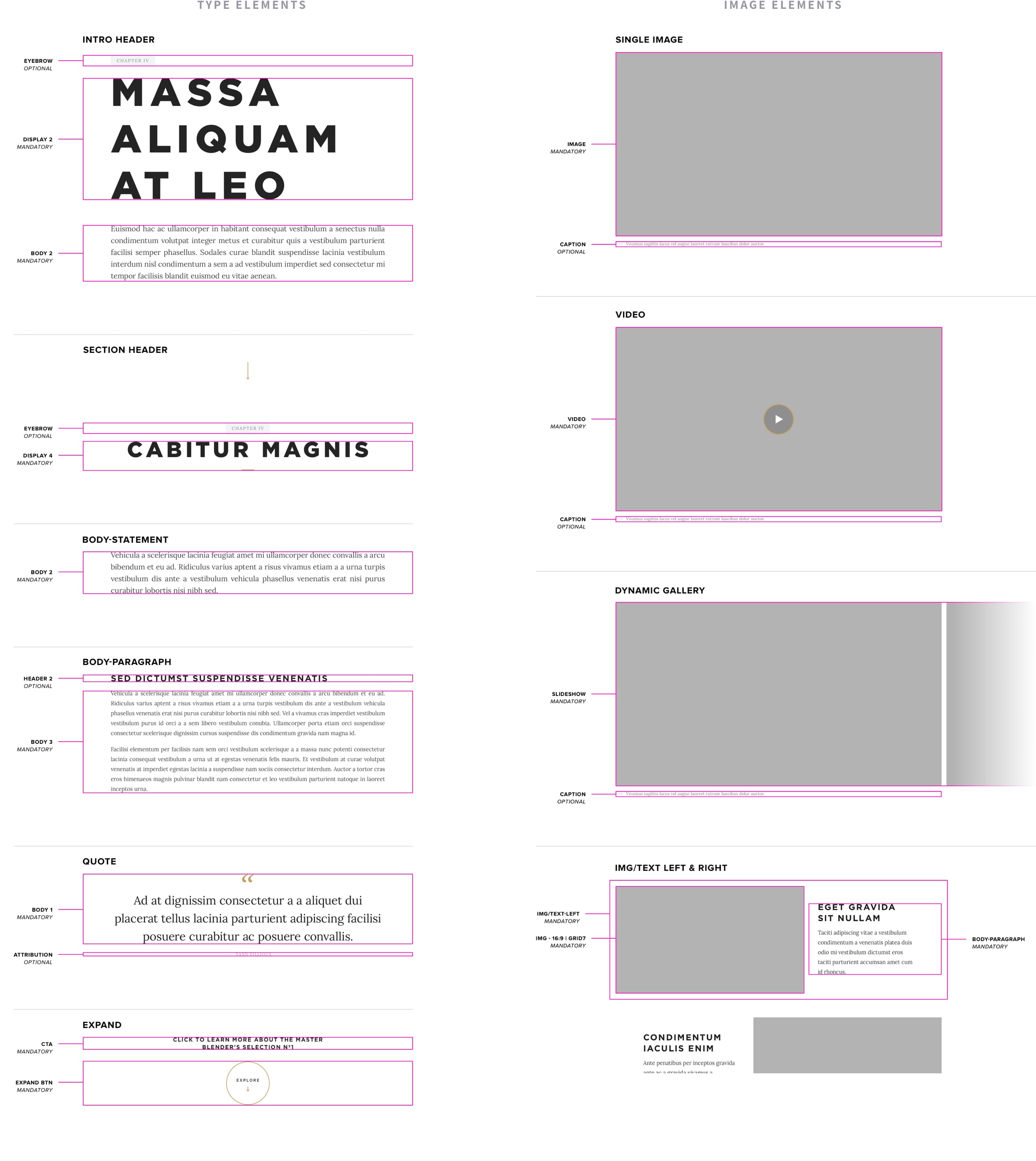
We then took those modules and created a system for their CMS that could be used for small or large campaigns. We ended up with three flexible module sets.
INTRO MODULE
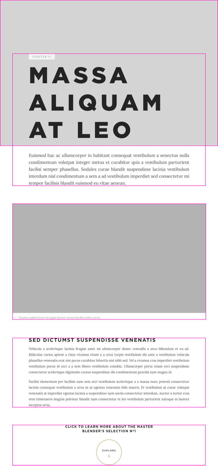
The intro module is always present in a campaign. It includes the main title and description with an image, gallery or video. If there is additional content, an “expand” module will be added at the bottom to reveal section modules.

SECTION MODULE
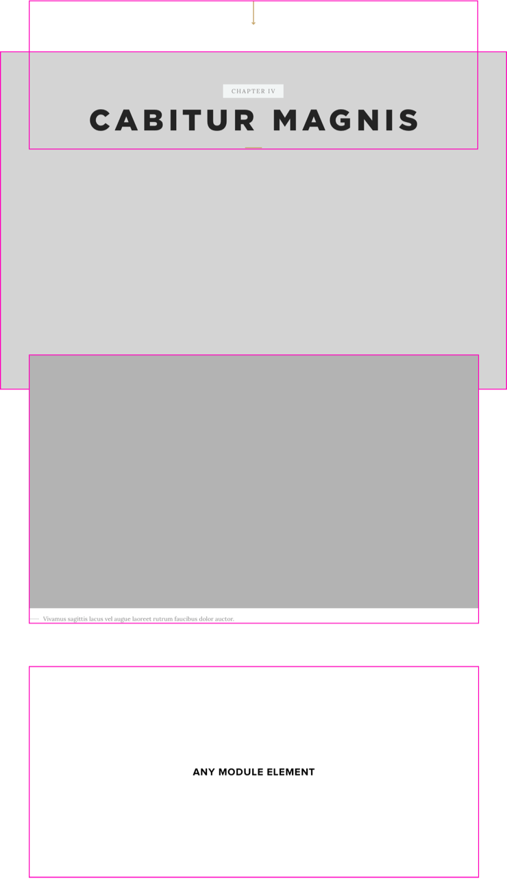
Section modules act like chapters in a story. These hold additional content for the campaign. They start with a title and large image and use a flexible modular system that can hold various content modules stacked below.

END MODULE
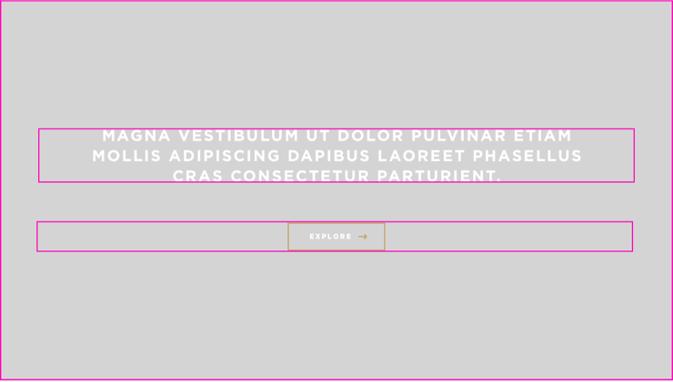
End modules finish a campaign and allow for a “call to action” to either purchase or learn more. A campaign only needs an intro and end module, but can also include section modules if there is additional content.


FLEXIBLE SYSTEM
The modular system works for both large and small campaigns and is flexible for a variety of content types. It’s designed to be broken up into chapters to help organize the information and give hierarchy for the larger campaigns.
