
2015 - 2017
Genentech
CLIENT
Genetech
ROLE
Concepting, UX, Visual Design
Genentech originally came to Odopod for help in educating people with serious diseases about the conditions they were living with. We had to very quickly take in a lot of complicated educational data and come up with a way to explain it so people could easily understand the concepts.
This opened up the door to many other projects with Genentech. They ranged from educational micro sites to full website redesigns, information architecture projects, internal system redesigns and even website redesigns for their partner companies.
GENENTECH WEBSITE REFRESH
Genentech needed an updated site that was easy to use and surfaced current stories in a clean, digestible way. They wanted an editorial style and a way to tell thoughtful, rich stories.
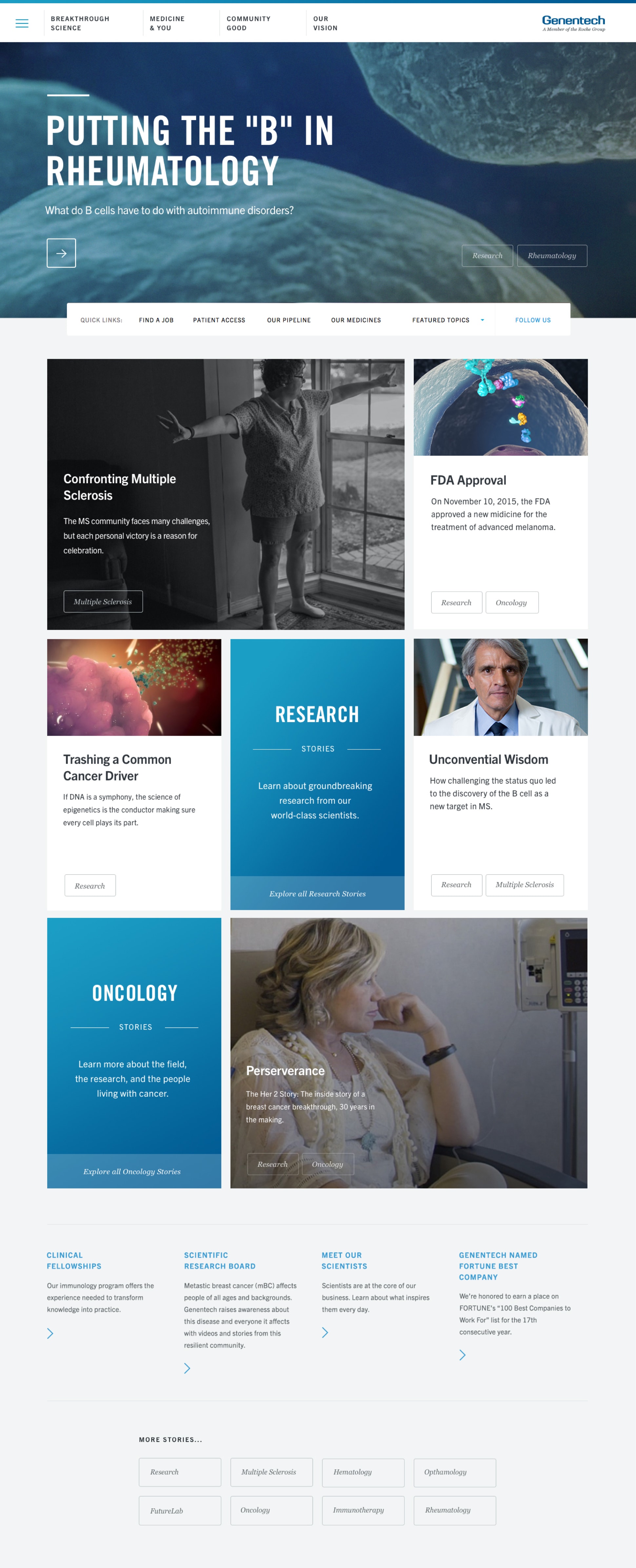

EDITORIAL FOCUS
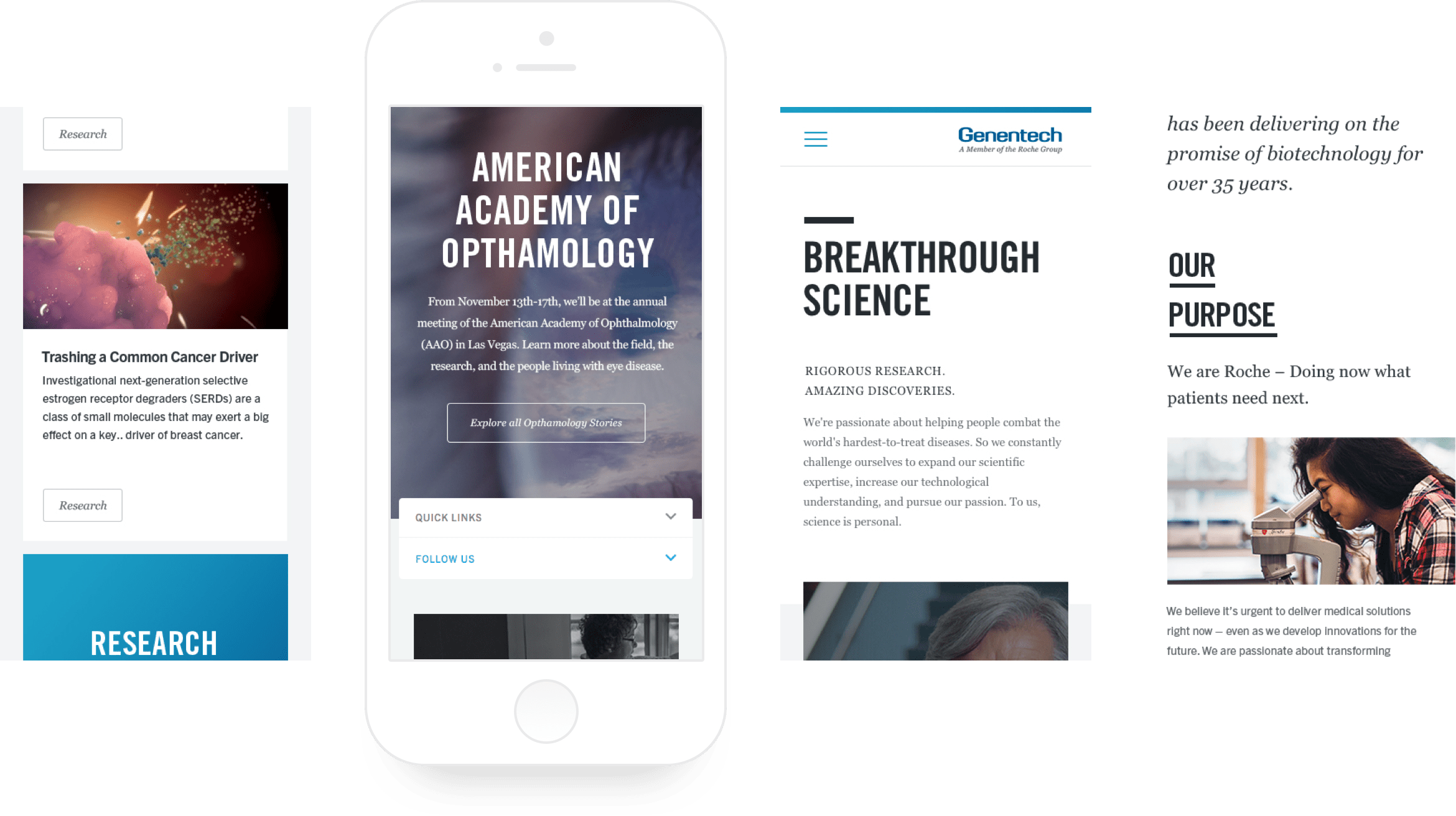
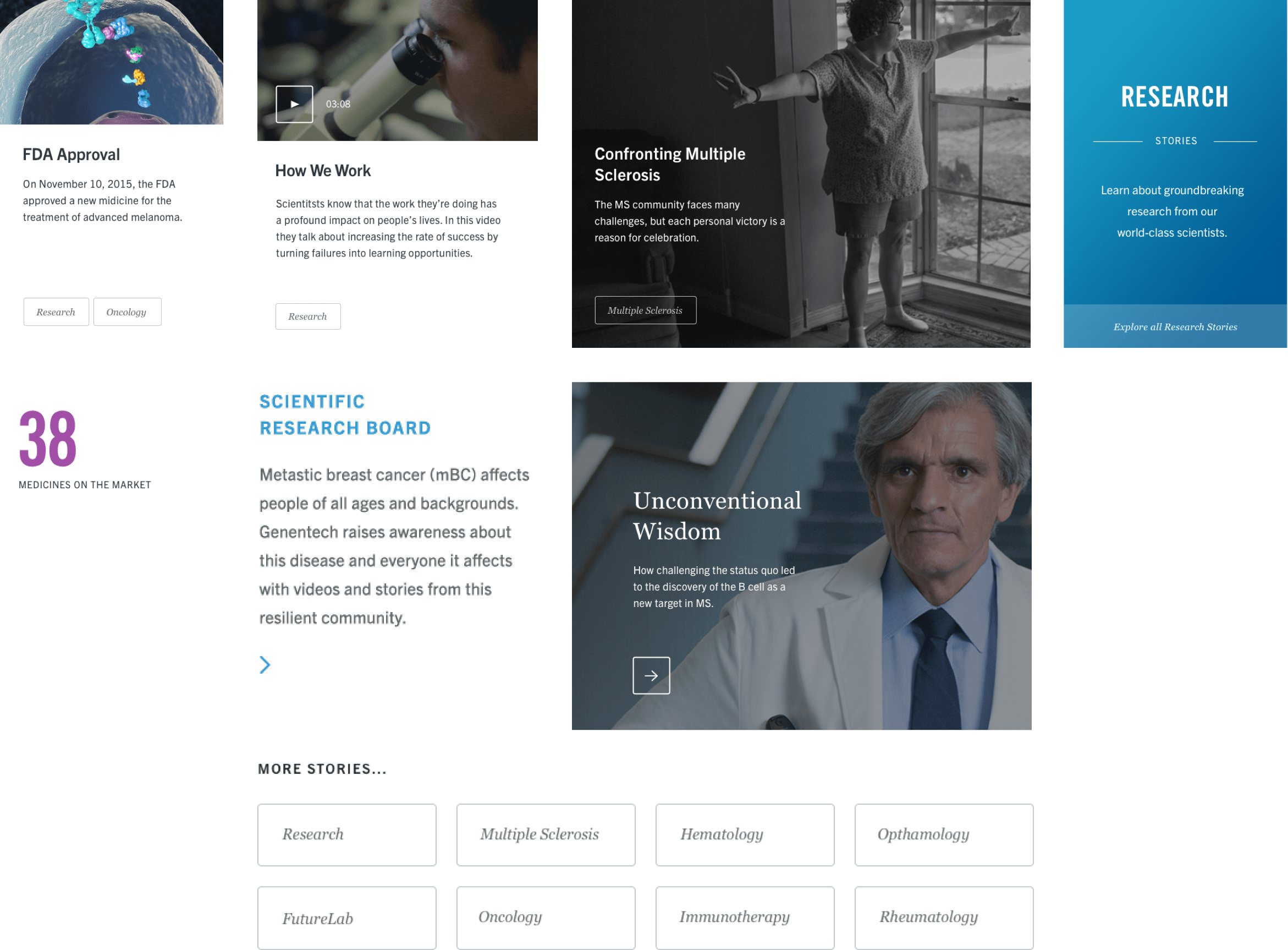
We brought editorial layouts to the home and landing pages making it easier to browse. We also created specific tiles for their diverse and extensive content types to create hierarchy.
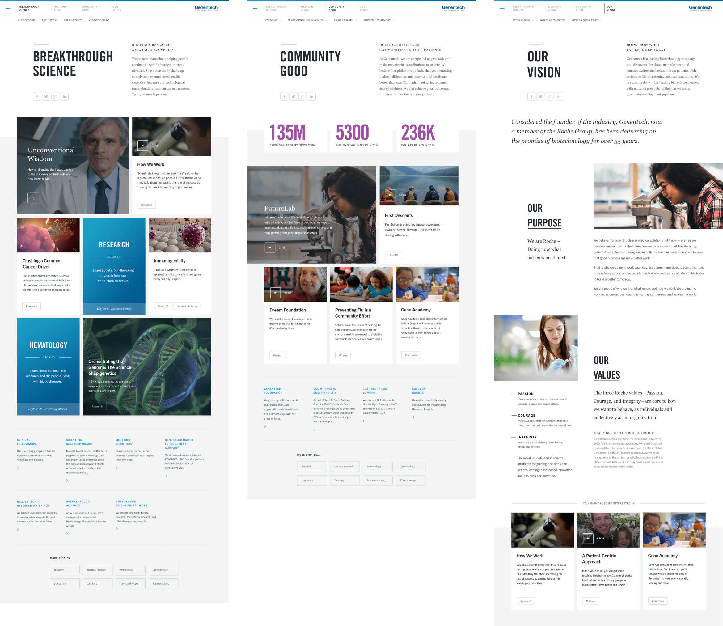


MODULAR SYSTEM
We broke the content down into responsive modules. This allowed the system to be flexible as it continued to grow and evolve.

GLOBAL NAVIGATION
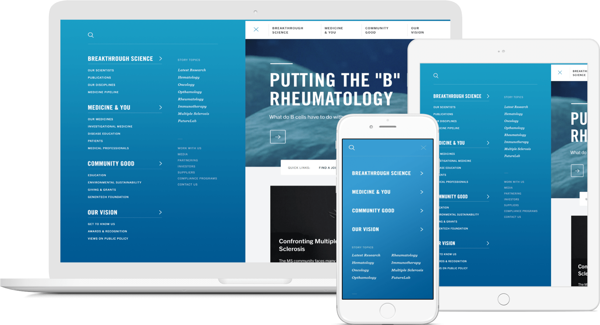
Gene.com is a robust site with a diverse set of content. We helped them restructure and simplify their navigation to make the options clear and easy to navigate, yet still support an evolving site structure.

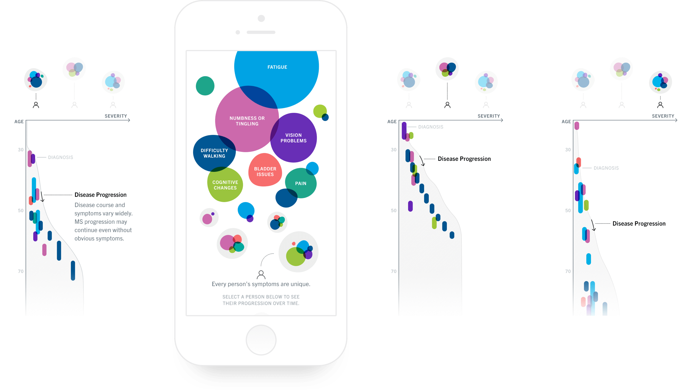
MULTIPLE SCLEROSIS INTERACTIVE INFOGRAPHIC
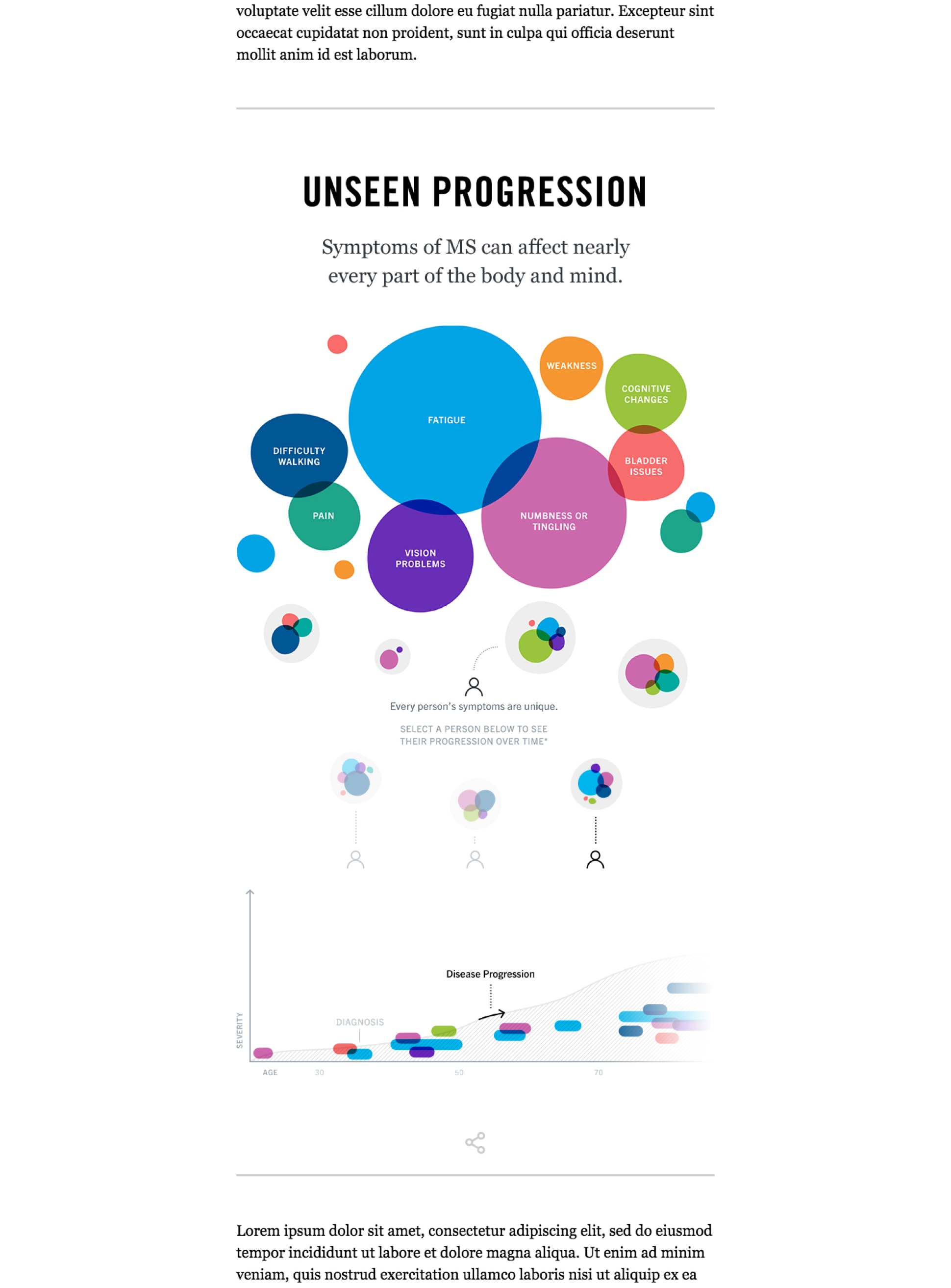
Genentech asked us to create an interactive infographic to explain multiple sclerosis for their MS micro site. Our challenge was to quickly become resident experts on MS to accurately educate others. Our next challenge was to create something educational, enjoyable, and easy to understand for such a difficult topic.


TAMIFLU INFOGRAPHIC
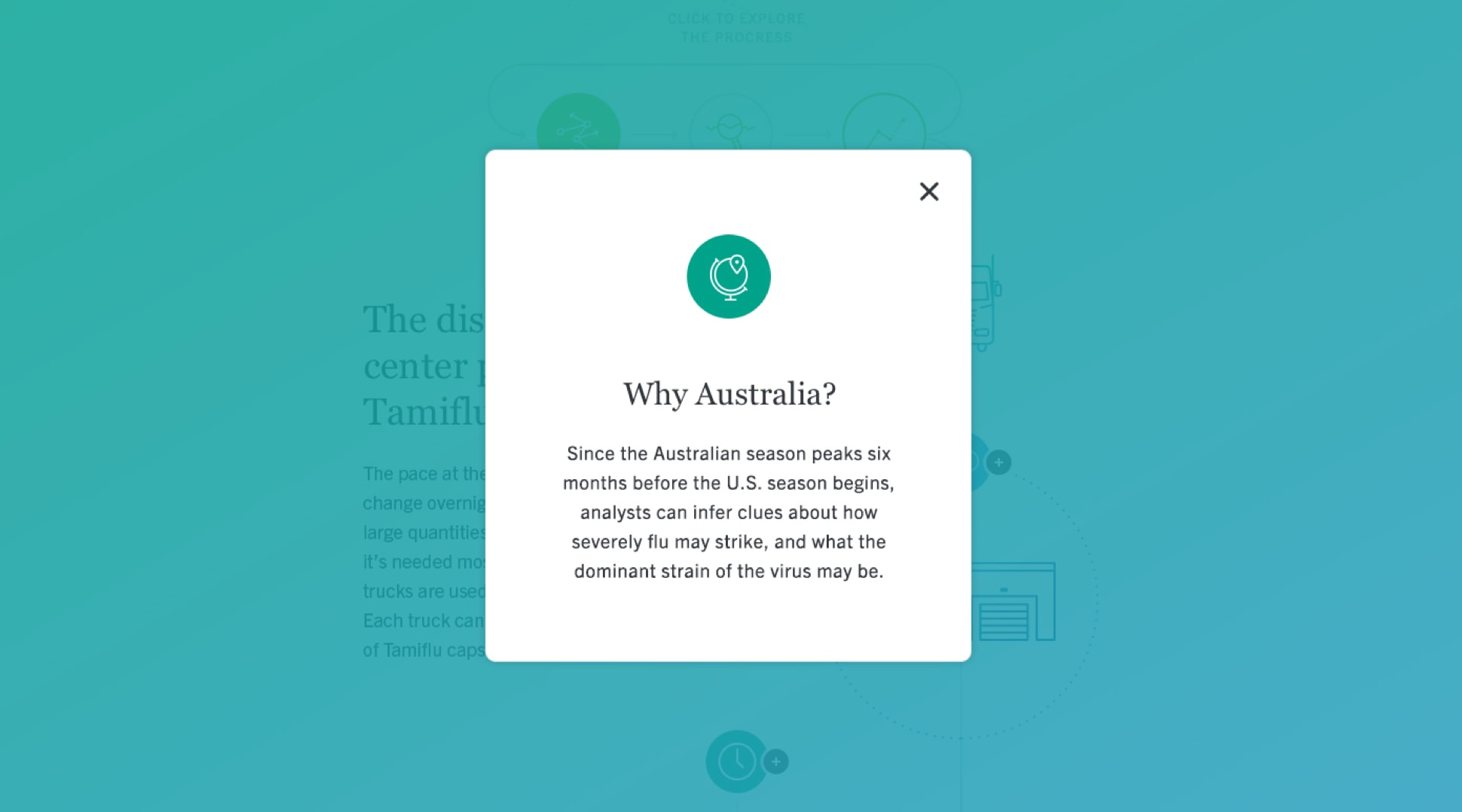
Genentech needed an infographic that would explain the production and delivery process of Tamiflu for one of their articles. We created an infographic to help the public understand what it took to get Tamiflu to them and the complications that could arise.



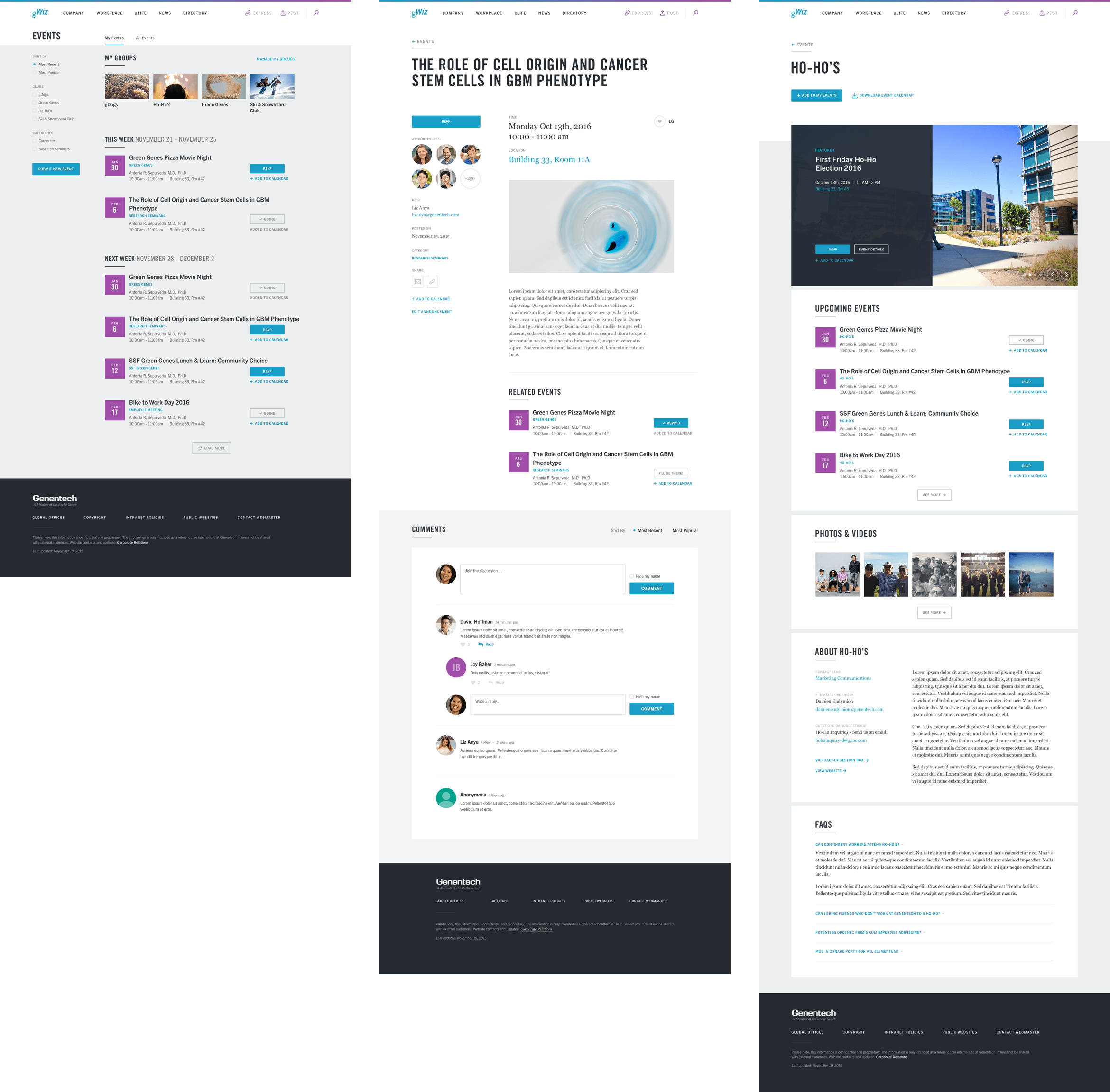
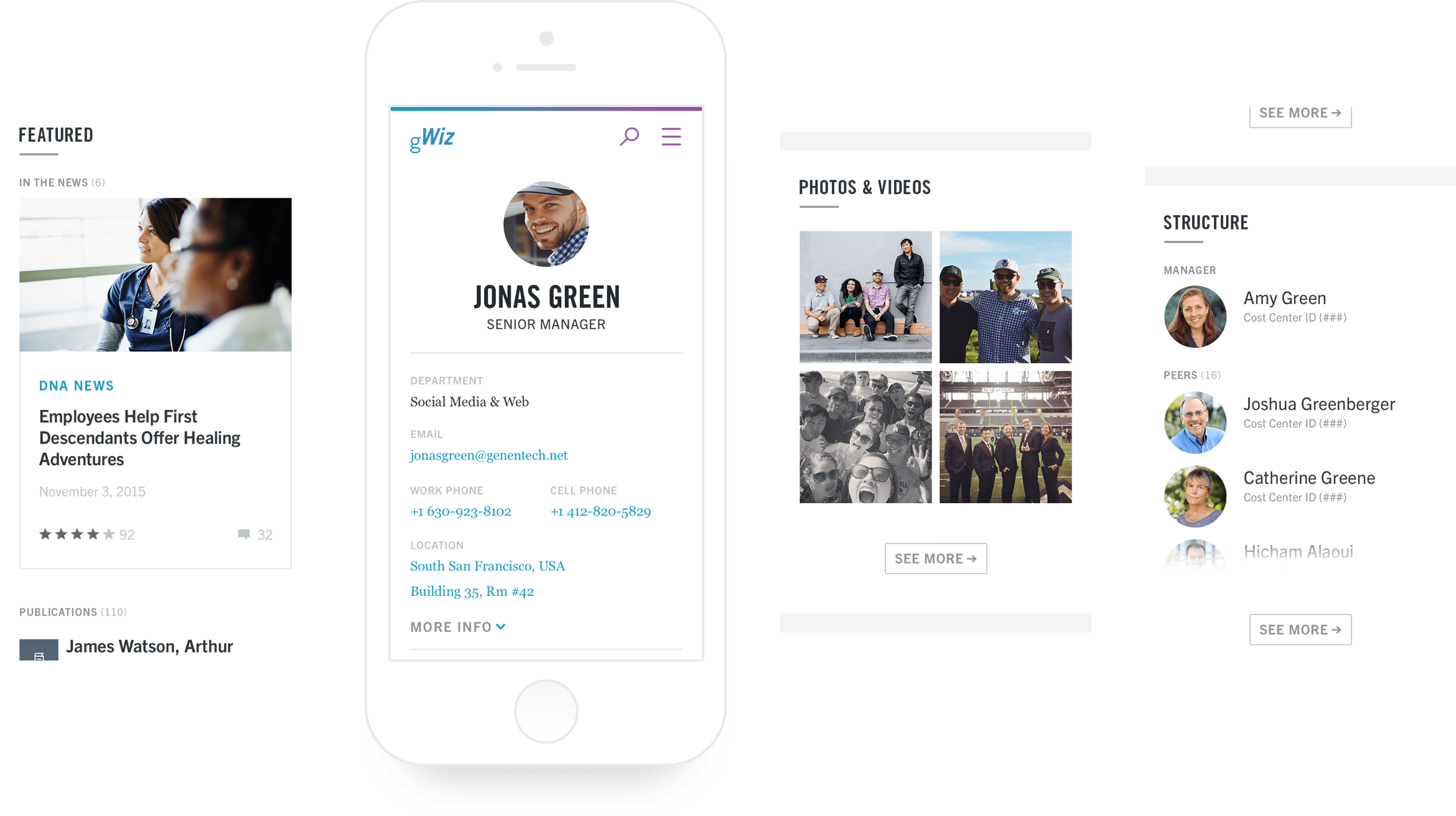
GWIZ WEBSITE REDESIGN
Genentech’s employee portal, gWiz, was outdated and not user friendly. They asked us to redesign the user experience and update it with the new brand style we had created for them.


