
2017
Caavo
CLIENT
Caavo
ROLE
Concepting, Product Design, Visual Design - focused on setting overall style and the unification between marketing and ecommerce
Caavo fully engaged Odopod across everything they did. We helped them with the ux and visual design of their product, the future vision, their marketing and ecommerce website, and even their packaging.
When Caavo came out with their new product, they needed a website that would sell Caavo’s sexiness, as well as give users a way to learn more about it and make a purchase.
Caavo came to us with a word mark and brand colors. Our challenge was to create a unique style that would showcase Caavo and work well for both marketing and ecommerce. We took cues from the sleek style of the actual product to give them something they could really own, creating a premium, rich and magical experience to showcase Caavo. The visual language that we designed has informed everything they've done from their digital presense to even their printed pieces.


MARKETING
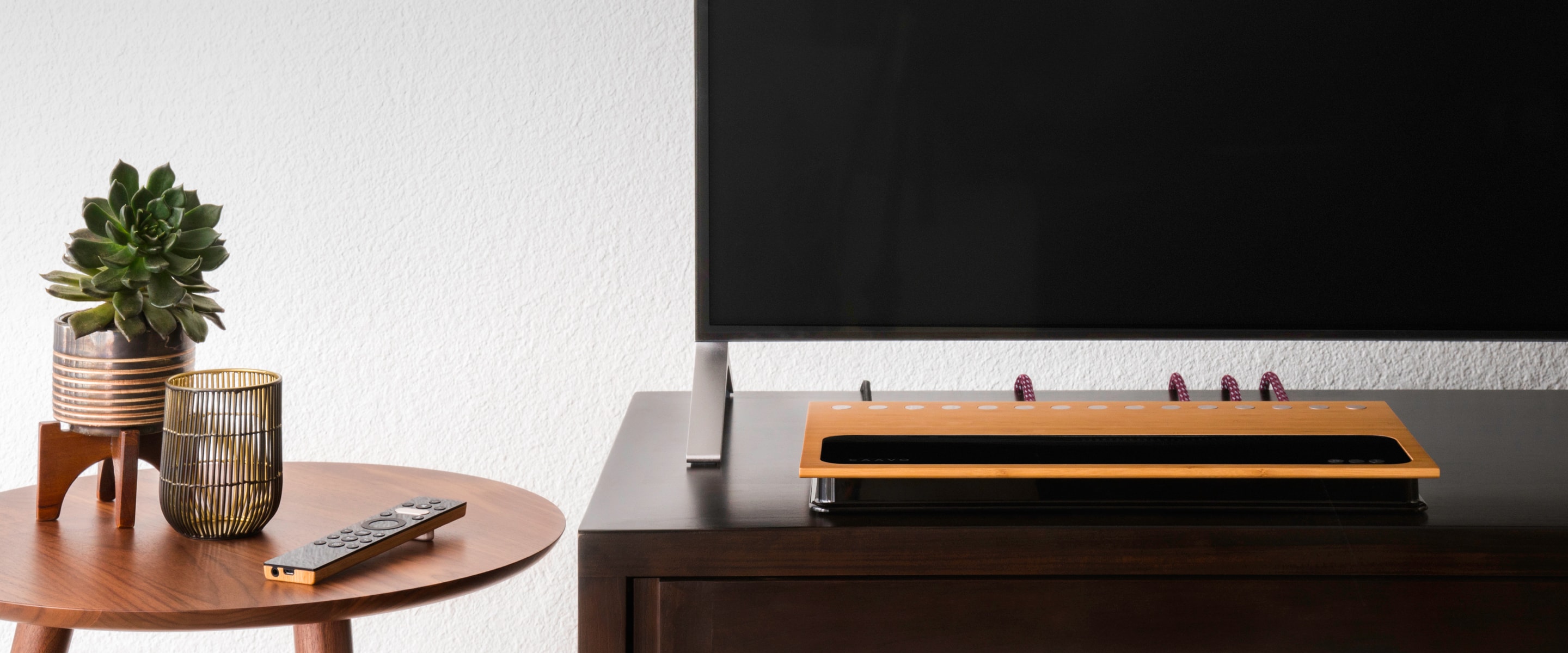
We created custom pages for Caavo’s marketing content to show off the product in the best way possible. We chose to keep the marketing pages dark to feel more premium and special.
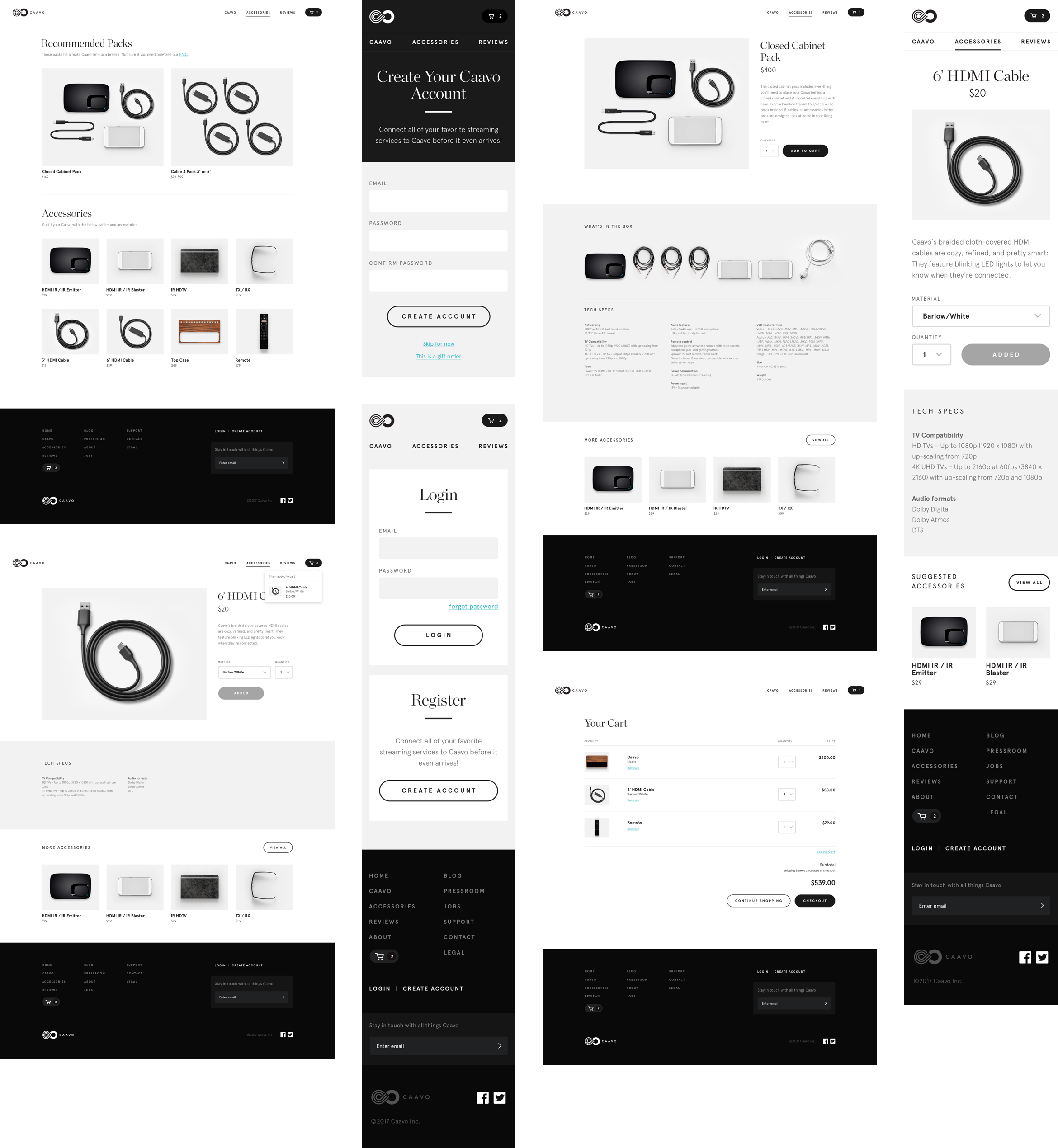
We transitioned the following ecommerce pages to a light background so the user would feel more comfortable in the purchase flow.
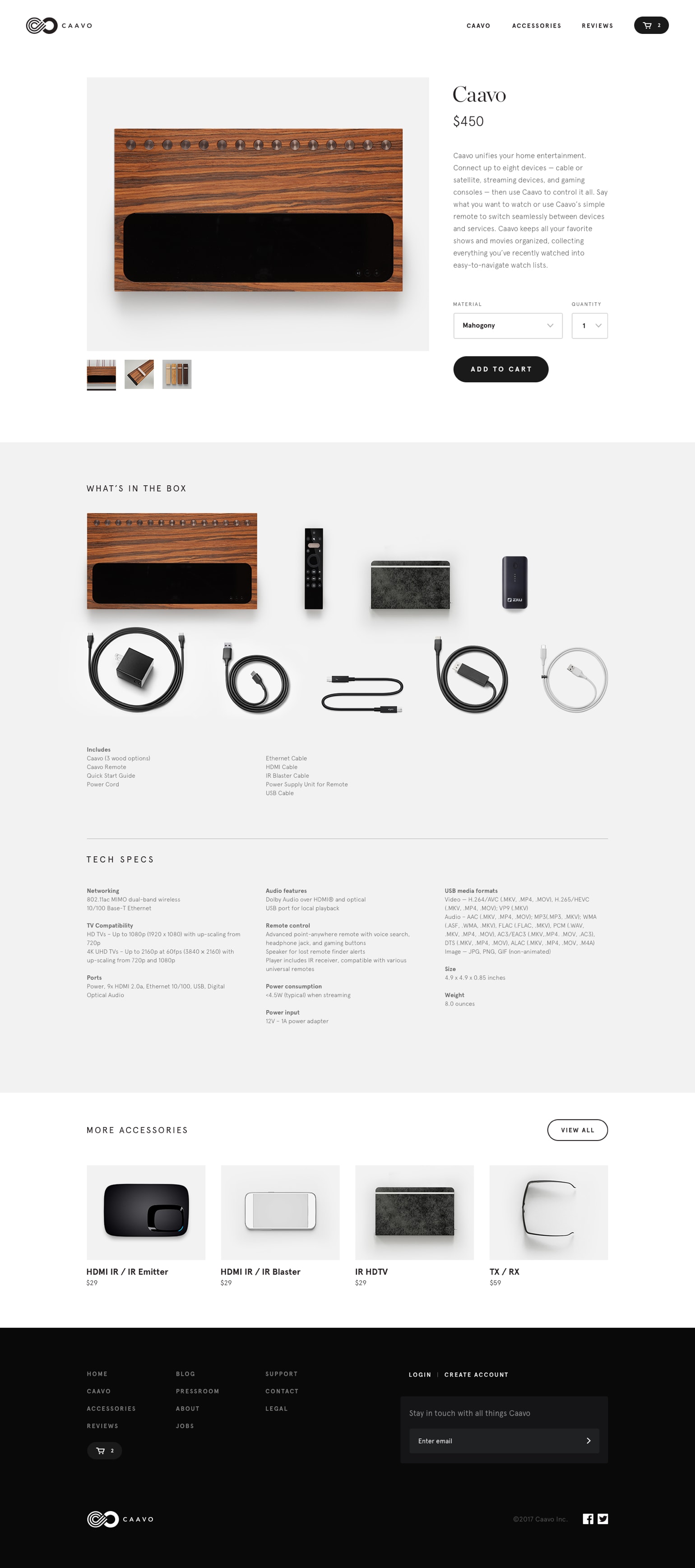

ECOMMERCE
A unique challenge on this project was how to integrate the new style from the marketing pages into Shopify. Working within template restraints, we were able to customize a template to fit both their needs and style.

STYLE GUIDE
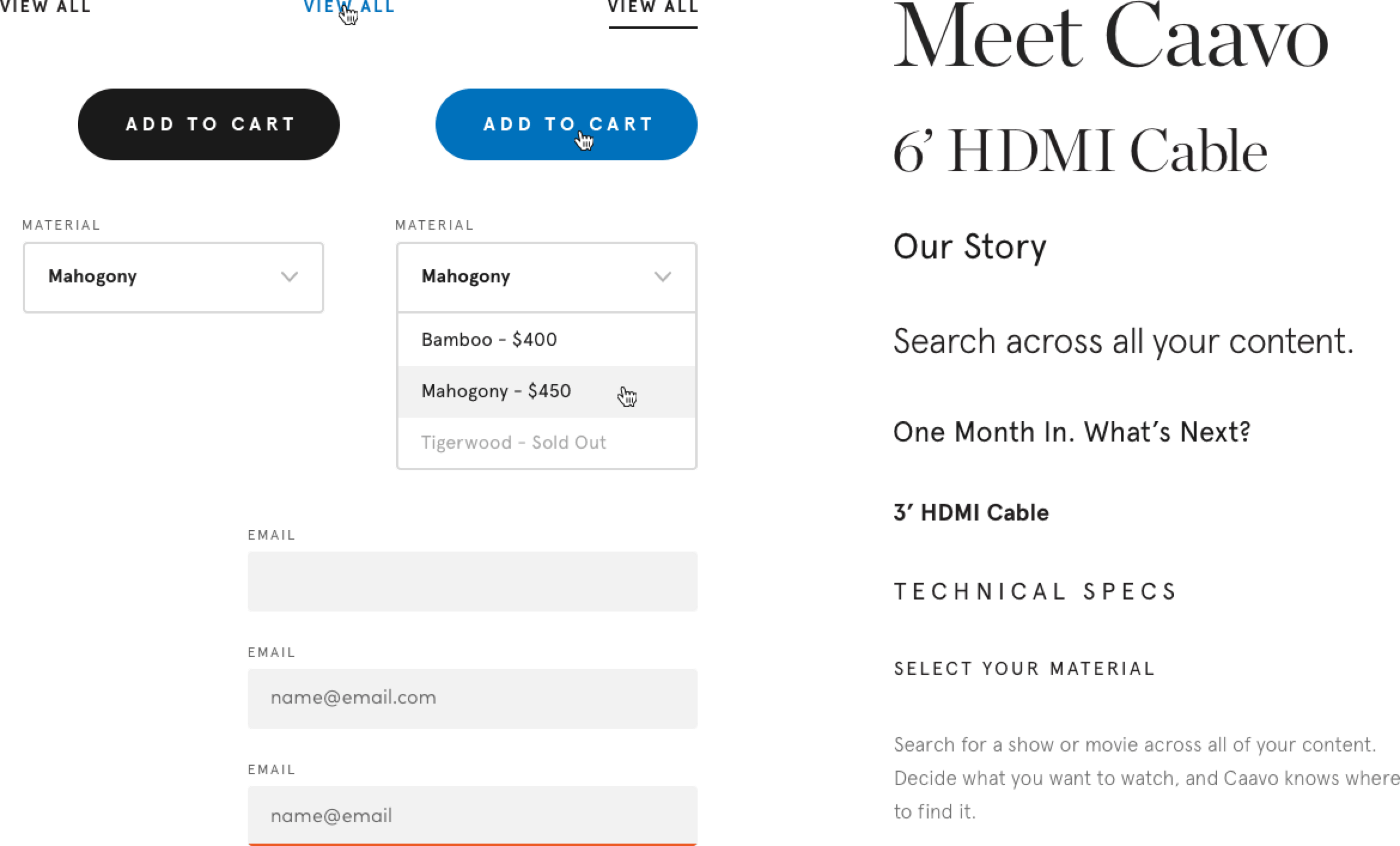
We created a detailed style guide for Caavo’s new design system.
