
2016
Sephora Collection
CLIENT
Sephora
ROLE
Product Design
We created fun, simple tools to improve e-commerce by revamping the customer experience. Snackable education moments help users learn and become more comfortable with the products. Focusing on a mobile first approach also added utility and usability to the design.
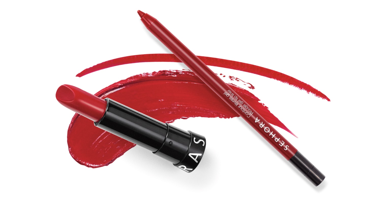

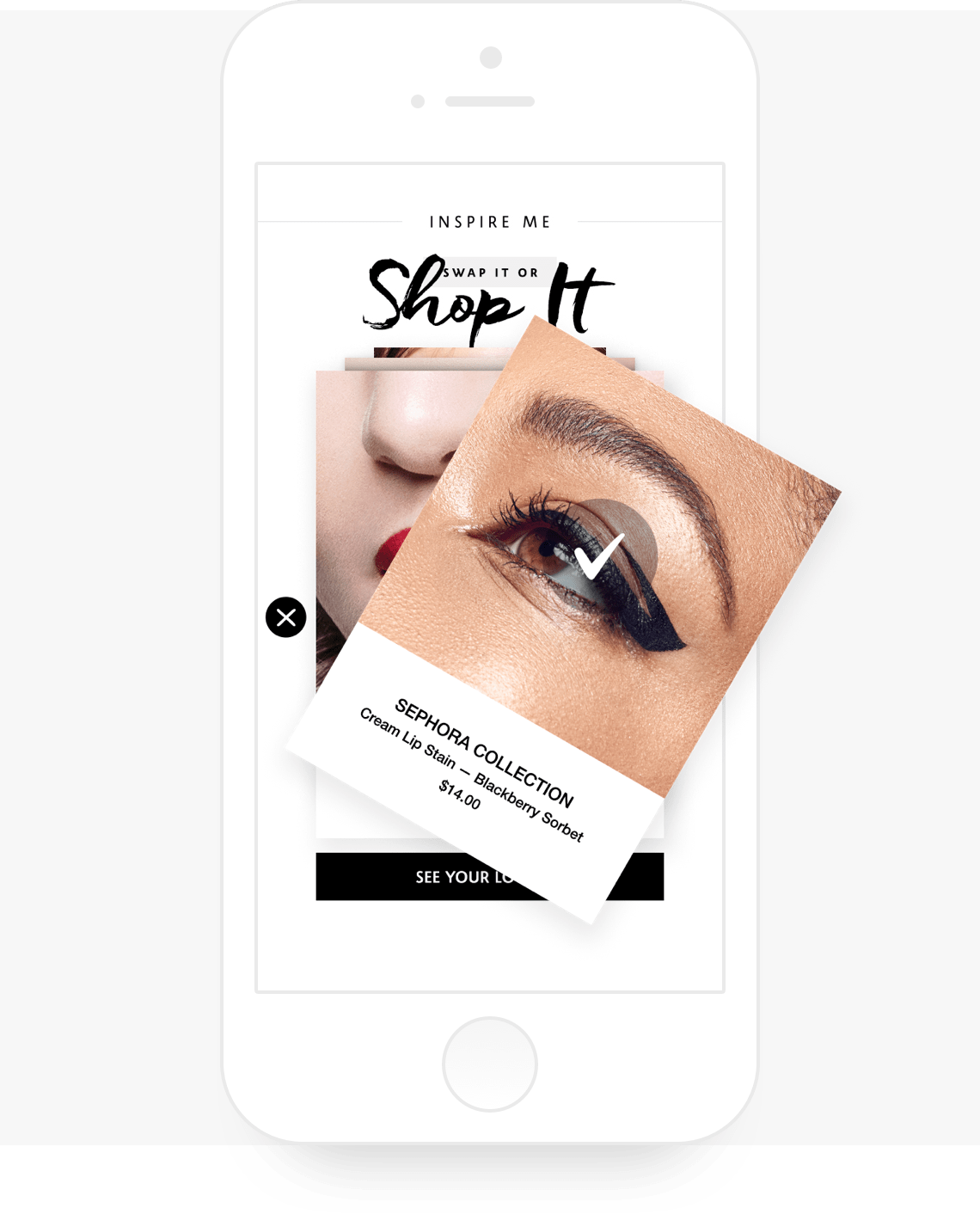
“SWAP IT, SHOP IT”
Inspired by the familiar Tinder model, this module lets the user discover products through different “looks”.

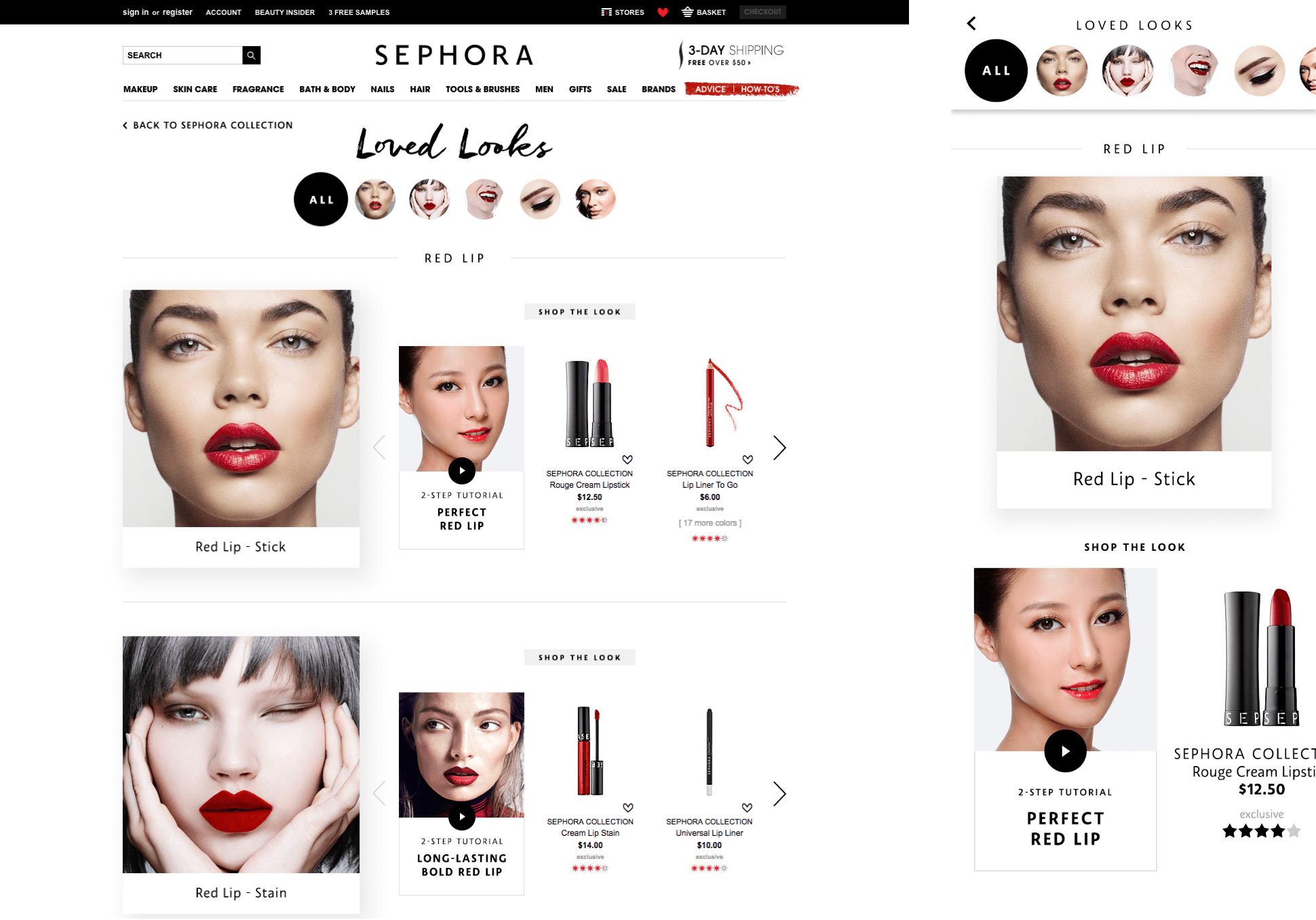
The “Loved Looks” feature allows the customer to learn which products to use to recreate looks they've loved through quick video tutorials.


BEAUTY UNCOMPLICATOR - "MAD LIBS"
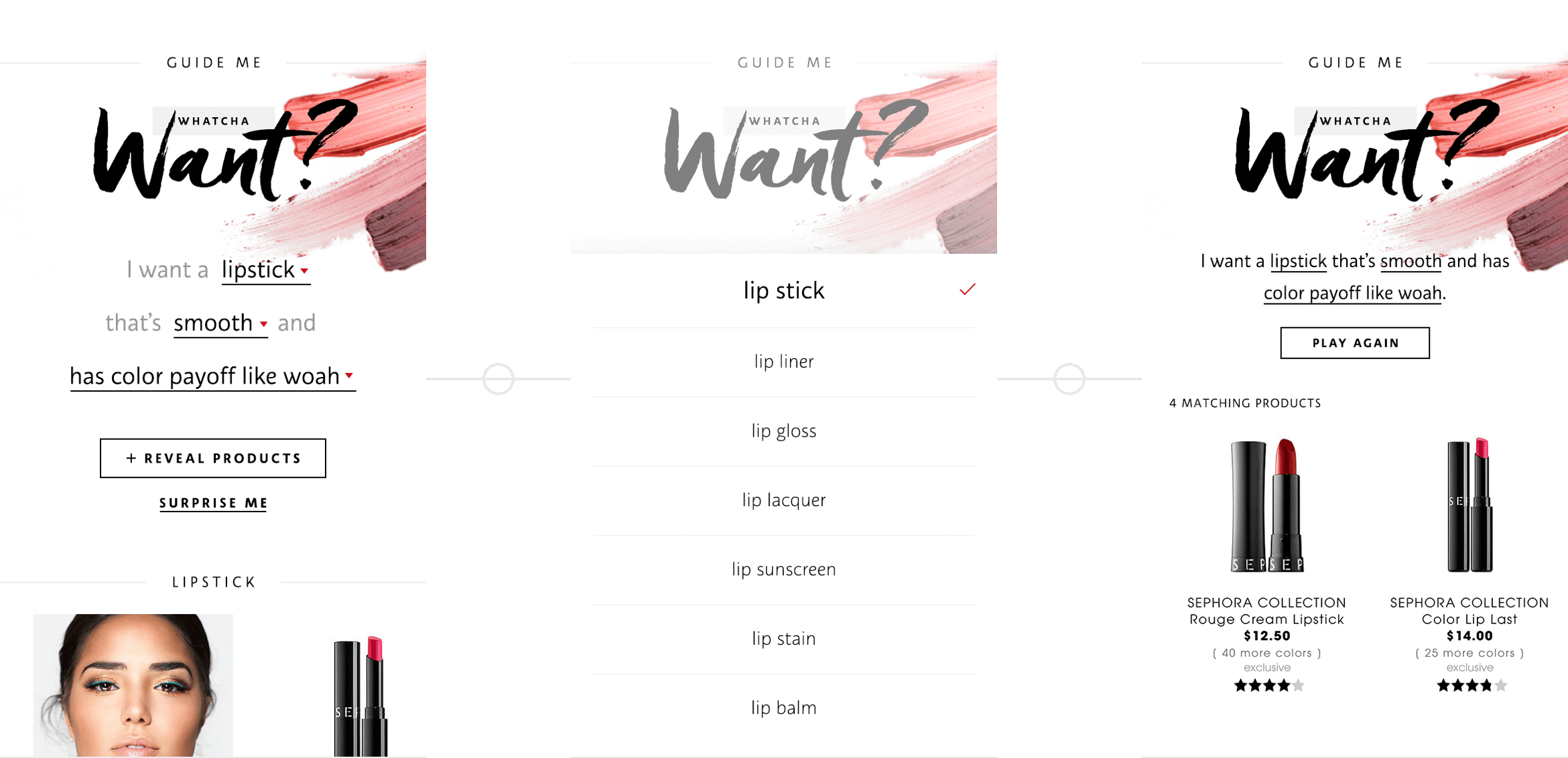
Finding the right product in a sea of options is overwhelming. The “Beauty Uncomplicator” module uses the "Choose Your Own Adventure model to help narrow down the search in a fun and easy way.


SNACKABLE BEAUTY
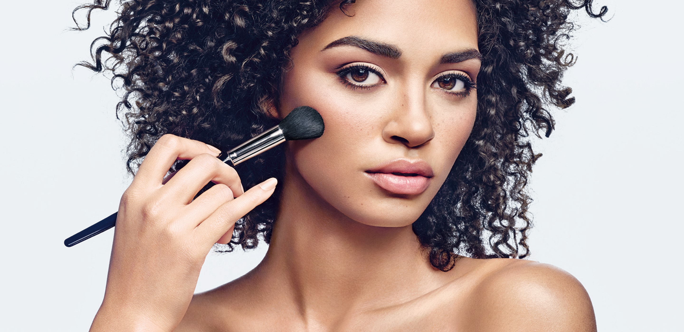
Educational moments teach techniques to help the user become more comfortable with products. We created areas to add educational videos and gifs to build users’ confidence in buying products.
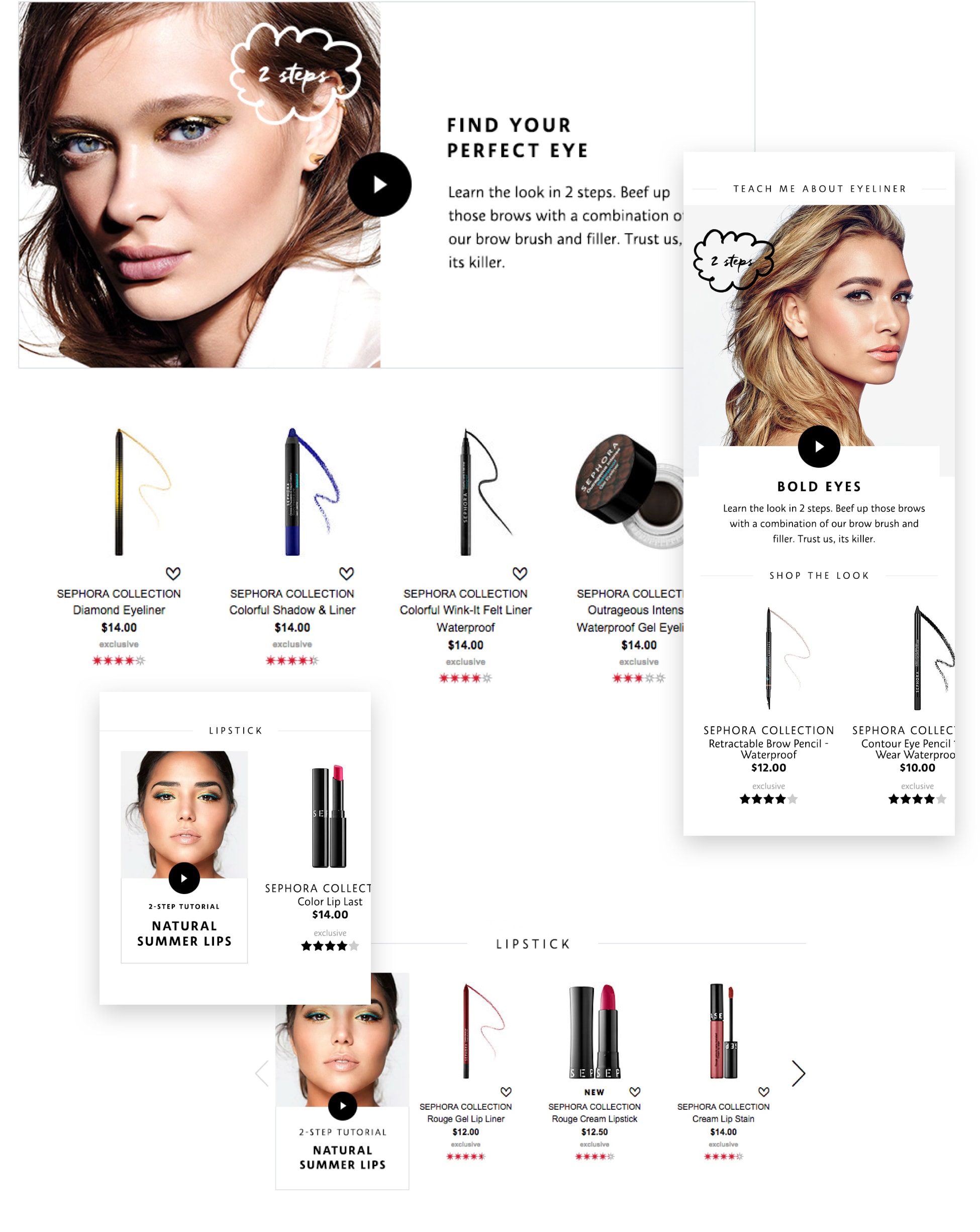

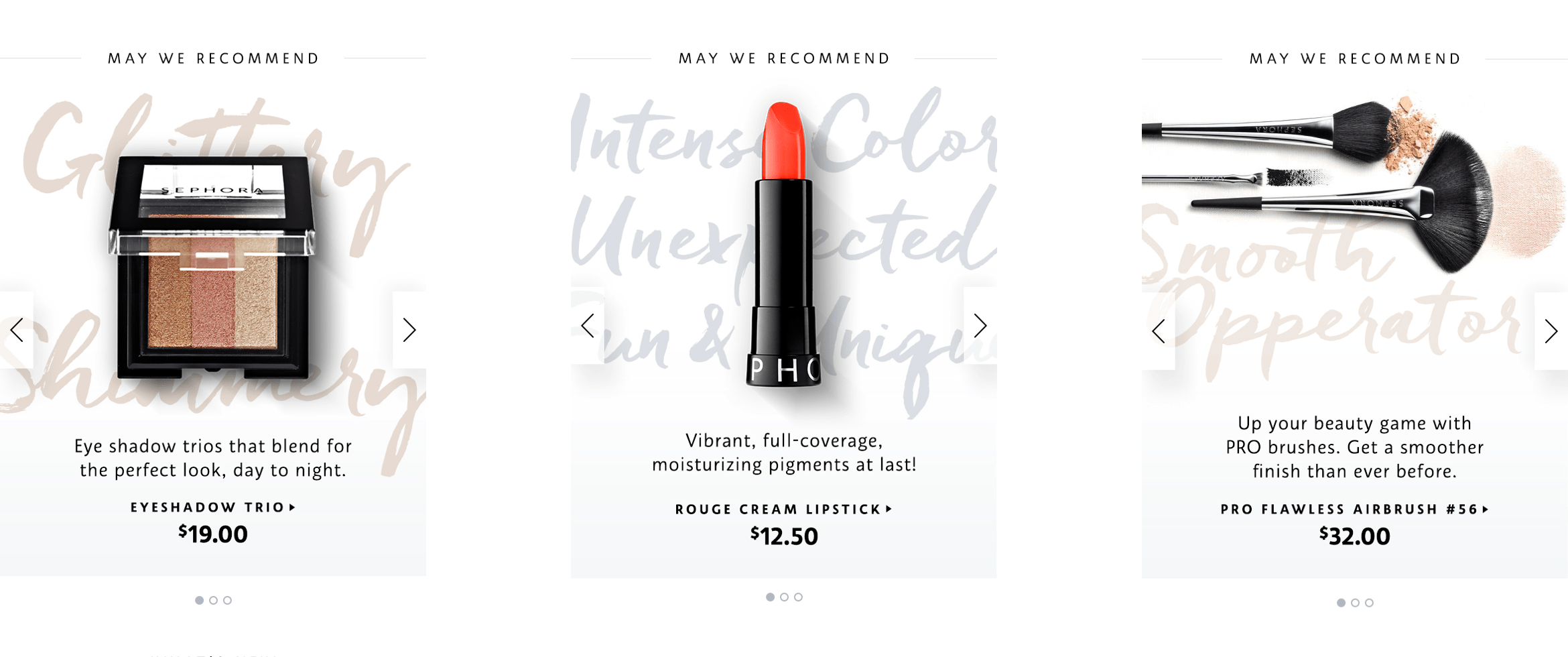
This specific style incorporates catchy phrases to highlight products in a unique way. We set aside this area on top of each page to showcase featured products in a way that Sephora Collection could own.
